Our Location
304 North Cardinal St.
Dorchester Center, MA 02124

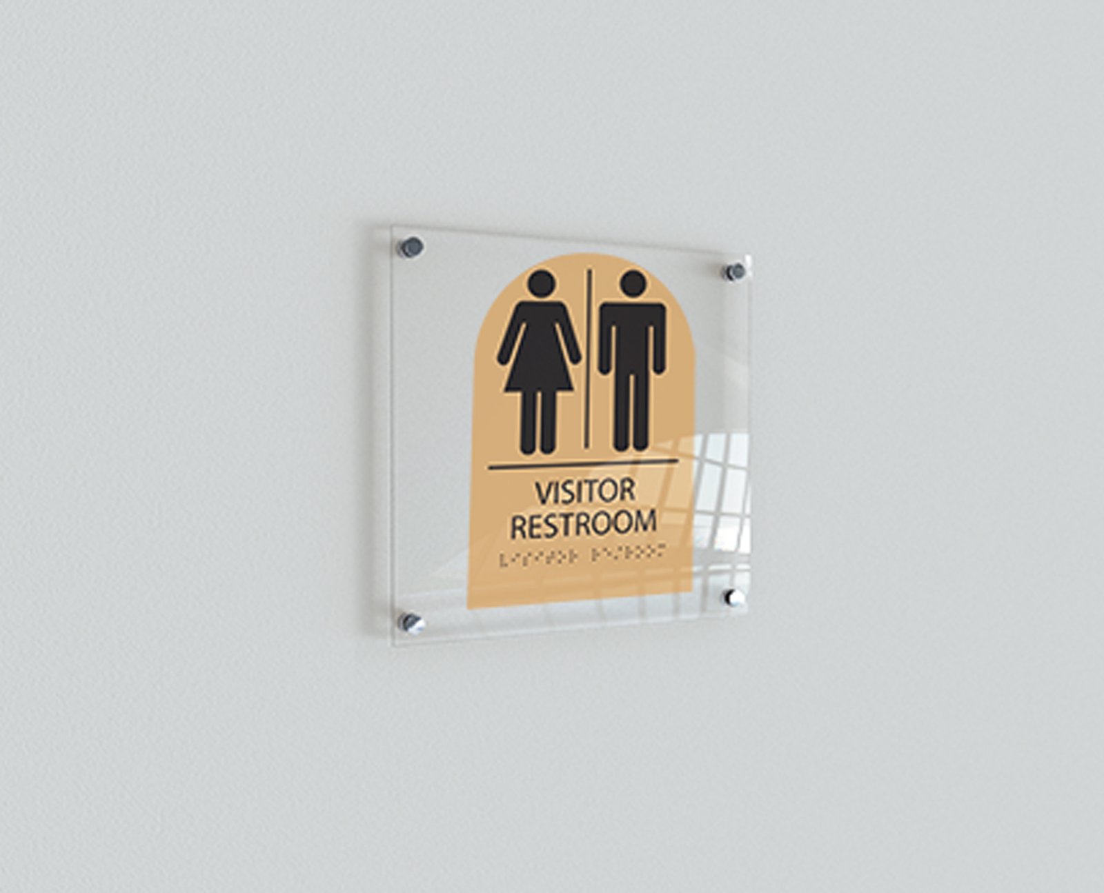
ADA is short for Americans with Disabilities Act, created in 1990, is a civil rights law created to protect those with disabilities from discrimination. ADA signs are used in both public and private buildings to help identify what room or space the person is about to enter.
Many people believe that braille signs and ADA signs are synonymous, but that is not the case. ADA signs come with more requirements, such as how far up they can be placed on walls and must have easy to read typefaces. These are just a couple of examples; we will dive more into that in a bit.
These signs are necessary for those who are blind or of old age. It helps them find their way around buildings more easily without requiring additional assistance. It also helps distinguish the difference between rooms are compartments for everyone, not just the disabled. You wouldn’t want to walk into the wrong classroom or office building if there were no wayfinding signs, would you?
Romark is one of the top brands for ADA sign materials, there are different categories to choose from, such as ColorCast, Ultra-Mattes, and ADA Alternative applique and substrate. These products need to be durable and sturdy, so they last for a long time. The wide range of materials also helps when newer buildings ae going for a certain interior design. You can still have compliant ADA signs that look good!
ColorCast Acrylics are cell cast acrylic products that are harder and have greater optical clarity. They are engineered for added custom branding or decorated looks while still being ADA compliant.
Ultra-Mattes are very ideal for ADA signs because they feature a non-glare matte finish. This product is remarkably interesting because you can also create special effects with reverse engraving.
With all the fun material out of the way, it’s time to talk about the important part: requirements. When it comes to creating wholesale ADA products, you need to know what to do.
ADA Sign size and space requirements:
The requirements specify a text height range of 5/8-2”, meaning you need to allow 2 inches of height per line of text, including the braille translation below. You must also take into consideration the size of the pictogram and braille on your ADA signs. You will need a 6-inch-high area for your pictogram and make sure to leave a minimum of 3/8 inch clearance on all side of braille.
ADA Sign Text requirements:
You want to use simple, easy to read text. Sans and serif fonts are the best route for this. You also want to use medium or bold weight, stray from italics, scripts or other hard-to -read fonts. For tactile signage, you want all text to be UPPERCASE. For visual or wayfinding signs, lowercase is fine. Some fonts to consider when creating your custom ADA signs: Helvetica, Verdana, Futura, and Eras are just a few.
Braille Regulations for ADA Signs:
Grade II Braille is a must when it comes to ADA/tactile signs. Grade II is not letter for letter, so you are able to add in more words with less space. Everything in Braille should be lowercase, excluding proper names. This is because most translation software are case-sensitive, so if you type in lowercase, the braille will be in lower case.
You also need to consider your dot sizing and spacing for Braille. The standard dimensions for Braille come from the 2010 ADA standards.
Measurement:
Dot height: 0.025” to 0.037”
Dot diameter: 0.059” to 0.063”
Spacing between dots: 0.090” to 0.100”
Vertical cell spacing: 0.395” to 0.400”
Horizontal cell spacing: 0.395” to 0.400”
Dot shaped: domed or rounded